


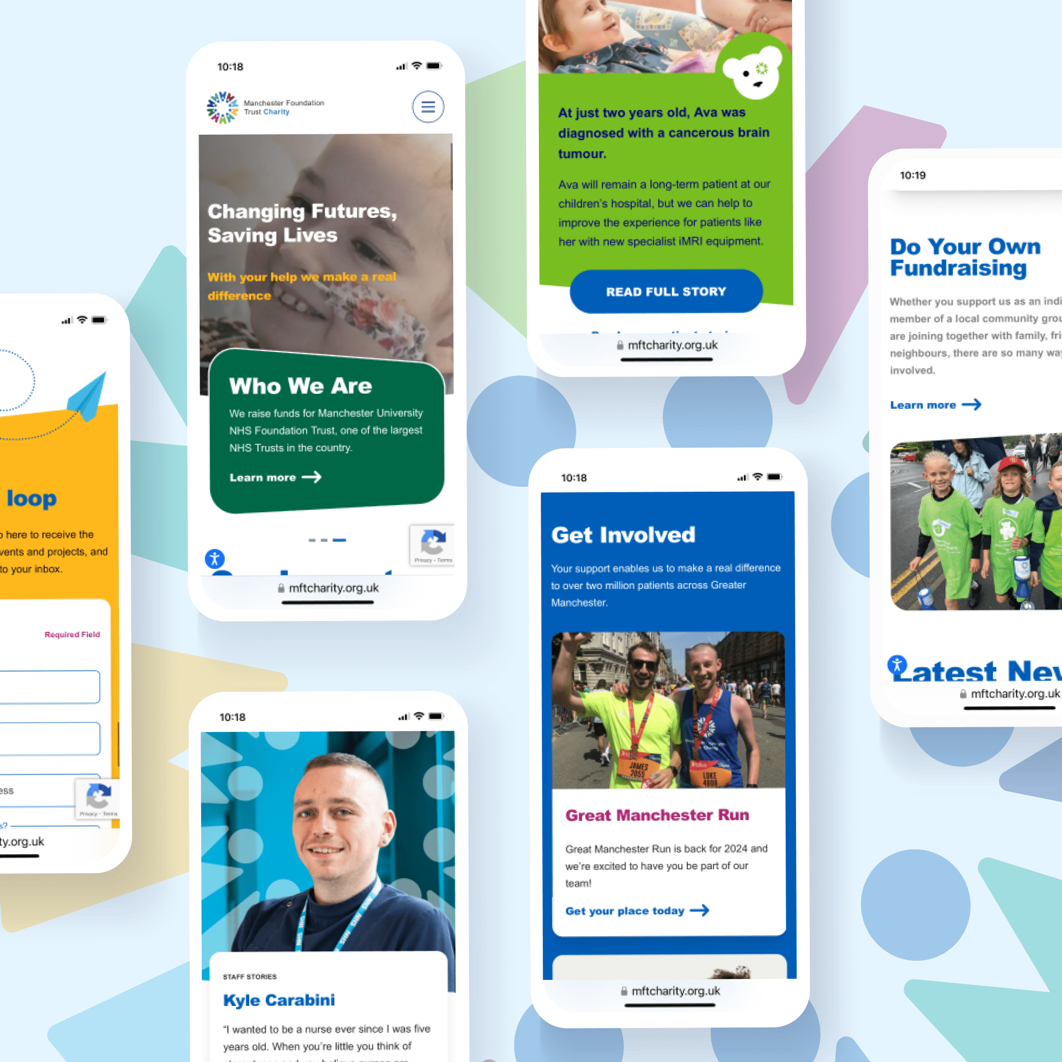
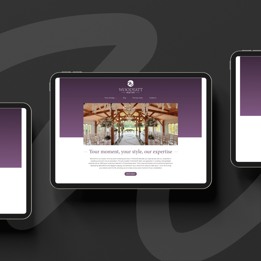
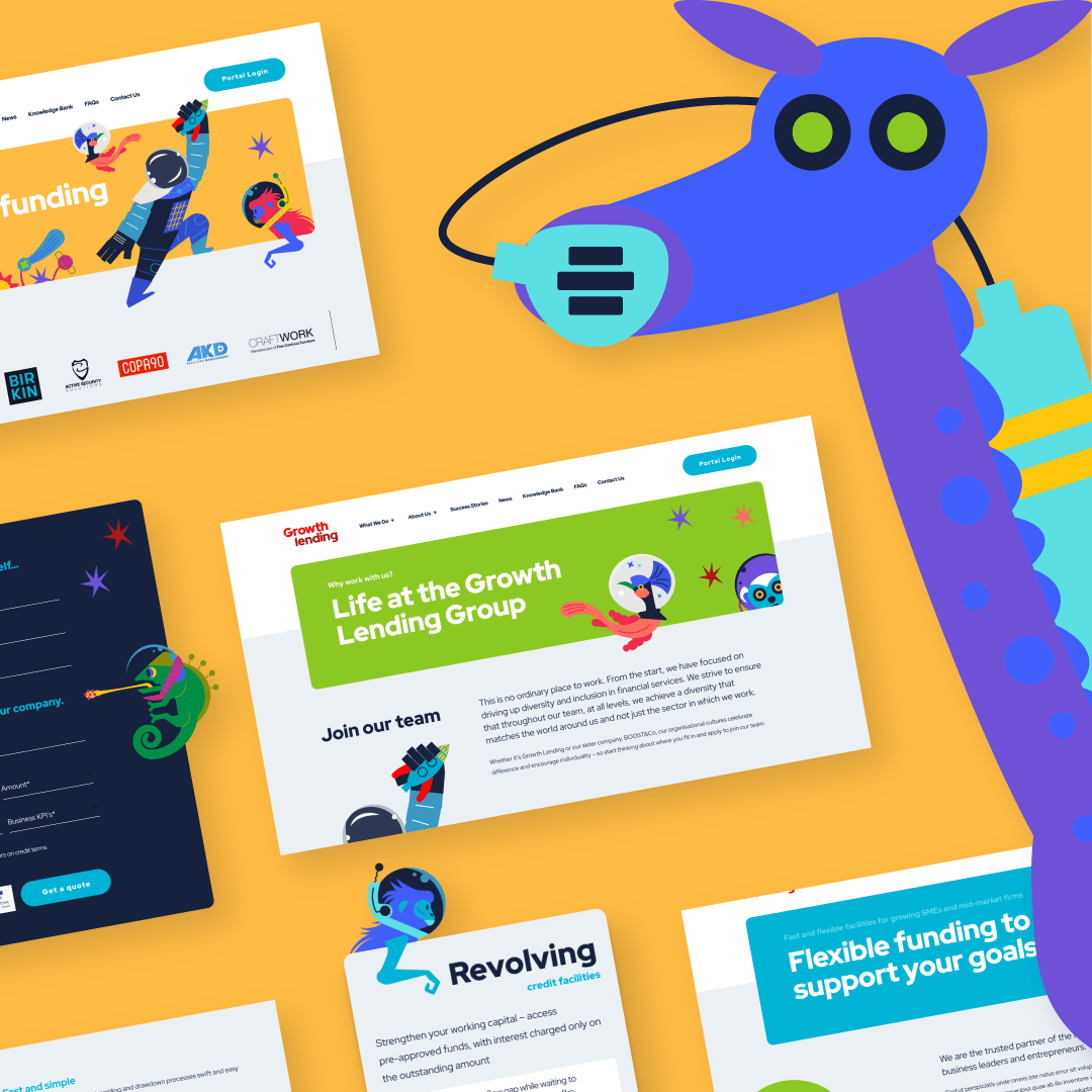
What is Responsive Web Design?
Responsive web design delivers a website that dynamically responds to the screen size, platform and orientation of the device that’s viewing it. As a user switches between a mobile device, a laptop, desktop or tablet, the website’s display, resolution, image size and scripting abilities will accommodate those changes. This ability to successfully render on all devices is possible via serving CSS properties that are dependent on the characteristics of a user’s device, plus the use of flexible grids, layouts and images. Responsive web designs eliminate the need for mobile-specific site builds; one web design is suitable for any viewing device.