If you’re one of our regular readers, then you’ll have noticed that we’ve got a lot to say about the importance of brands, and with good reason. Your brand supports pretty much any other form of marketing activity that you could ever choose to pursue. It really is that important!
We’re passionate advocates for brand building, and one of the most important ways to make sure your brand name is as strong as it can be is to invest in some good brand guidelines.
Over the years, our wonderful design team has created some great brand guidelines for our partners (if we do say so ourselves!). We therefore thought it was high time to show off some of their hard work, and also discuss some key principles within all good brand guidelines.
TL; DR: Brand guidelines help your brand identity to be considered at every stage of all communication channels. Great brand guidelines should include practical guidance for logo usage, typography, colour palettes and use of imagery and iconography. However, they should also cover your brand mission/vision/values, tone of voice, digital (and print use) specifications, and any legal content including copyright and trademarks. Having a brand guidelines document means that your brand identity can be communicated as easily and widely as possible, which is going to be vital in a world where performance marketing is more complicated than ever due to the limitations of third-party data.

What Are Brand Guidelines?
Before we let our designers loose, let’s begin with the basics.
Brand guidelines are essentially a set of rules that define how your brand should look and feel across various marketing and communication materials. They’re usually compiled within some form of document (physical or digital… although digital allows for easier distribution!). An all-encompassing set of brand guidelines will cover a huge variety of things, ranging from typography, logo usage, colour palettes, tone of voice, mission statements, values, and more.
Simple? Sure, but we think it’s important to define just what we mean before we go on to explore…
Why Are Brand Guidelines Important?
Brand guidelines seek to create consistency and clarity within all of your brand messaging.
They help you to create a clear alignment between your teams and customer touchpoints.
It’s easy for your brand identity to become diluted by inconsistencies and improper use, especially over time, and this can really hold you back. Brand recognition should be a major priority. In fact, we’ve only recently been saying that we think that building your brand is one of the single most important things that you can do in a world where search engines are actively trying to prevent people from clicking through to websites, and changing online privacy measures are crippling third-party data.
If your brand is well known and actively engaged with, then you’re always going to have a steady stream of customers, regardless of how many AI-generated answers and zero-click search results are draining your potential organic traffic. But that’s not all: you’ll also be planting green shoots for the future, as more and more people hear about you.
And what’s the best way to make sure that the heart of your brand is always presented as you want it to be?
Yep, you guessed it.
Brand guidelines!
What Should You Include in Brand Guidelines?
Your brand guidelines need to capture the identity of your brand within all messaging, visuals and applications. They also need to add the components that are missing from your current brand guidelines, and present an effective strategy to breathe real life into your brand. After all, employees tend not to embrace something holistically unless it engages them!
There’s no use presenting someone with a lifeless document of “rules” and expecting it to be followed to the letter. However, an employee that can see the value in a brand guidelines document – and maybe even like what they see – will naturally try to adopt what it outlines. And if the vast majority of employees are onboard, deviation from brand identity will be almost non-existent.
When our designers create a set of brand guidelines, they try to include a comprehensive suite of elements to make sure that every single thing is defined! They’ll cover:
- Your mission.
- Your vision.
- Your values.
- The usage of your logo, including its anatomy and meaning, min/max dimensions, restrictions (with examples of misuse), spatial requirements, straplines, colour and layout variations, secondary and tertiary lockups, and application examples.
- Colour palettes, including primary, secondary and tertiary colours.
- Your primary and secondary fonts, and when they should be used. Our documentation will also explore acceptable replacements in cases where your choices can’t be used, hierarchy and headline best practices, suitable pairings, and legibility considerations.
- The usage of illustrations and icons (plus design examples/templates for those assets).
- The usage of photographs, including suggested treatments, interactions, composition, lighting colours, locations, personality, and demographics
- The usage of video, including transition speeds and effects, scripts, sounds and music, opening/closing branding bumpers, logo animations, output requirements, file naming conventions, and guidelines for casting and animation.
- Layout and composition.
- Tone of voice documentation, including goals and principles, grammar and mechanics, advice on creating structure content, effective translation principles for international audiences, and guidelines for spoken communication and emoji usage.
- Taglines.
- How your brand is represented on print applications (e.g. stationery, marketing collateral, merchandising, artwork guidelines, apparel, etc).
- Trademark usage and legal content relating to copyright information.
But it’s alright talking about things like this in isolation. We told you at the start of this article that our designers have created some great brand guidelines, so you want to see some of them, right?
Of course you do!
Here are a couple of our favourites.
Centre of Excellence
This was a classic example of what we mentioned a little bit earlier, where inconsistencies can creep into brand guidelines over time. All perfectly understandable, especially given Centre of Excellence’s (CoE) prolific growth, but still very important to address!
The 24-page brand guidelines document that we created for them tried to anchor everything in their core ambitions to be inspirational, empowering, supportive and inclusive.
We particularly want to comment on how brand guidelines can build inclusivity, because it might not be readily apparent. However, loads of things can contribute to this:
- Photography that shows that a brand is seeking to serve people just like the searcher.
- Typography that’s easy to read, and that supports accessibility.
- A tone of voice that seeks to unite, not to divide.
- Guidelines for sensitive humour, emoji and hashtag usage.
You get the picture!
We sorted all this and more out for CoE.

FIND OUT MORE: Visit our Centre of Excellence Case Study
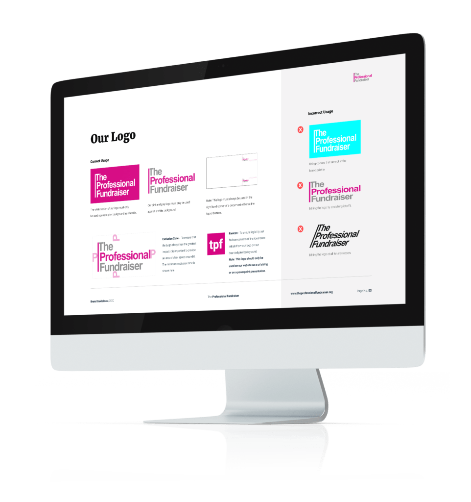
Professional Fundraiser
The Professional Fundraiser came to us with one of the clearest briefs we’ve ever seen. They told us that:
“We want our clients to see our branding and know at a glance that they are about to receive amazing customer service and incredible attention to detail. From colours to fonts; text to pictures; we want everything we send out to the world to scream – The Professional Fundraiser.”
Are you wondering how on Earth we could cover all of that within a brand guidelines document?!
Well, honestly it’s just a case of treating each and every one of the elements that we listed above with a lot of care and attention, and thinking about how they can all convey something of our partners’ values.
In the case of The Professional Fundraiser this particularly meant taking into account that they had a lot of physical marketing materials as well as a website. Therefore, they needed their logos, typography and colours to look, well, professional on all of them!
And when we say to treat every element with care and attention, we really do mean every one… so we even provided them with guidelines for their email signatures!

FIND OUT MORE: Visit our Professional Fundraiser Case Study
Define Your Brand Guidelines with Soap Media
If you’ve got a great brand identity but are looking to define it properly (and you should be because a strong brand is going to be one of your biggest assets in the coming months), then we’d love to hear from you! We can not only create some stellar brand guidelines to ensure brand alignment across all of your operations, but we can also give you some pointers about how to communicate them properly via training or easy digital access. What’s not to love?
Contact us to find out how we can help you with brand guidelines.
