Develop A Cutting Edge Strategy

Before developing the UI, we invested a lot of time understanding each user’s intent, along with what they wanted with regard to information from the site, by reviewing the history of their analytics account.
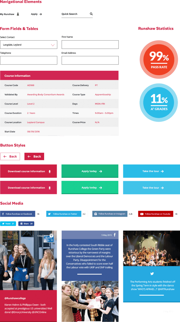
From this, it was clear there were a lot of pain points and drop off rates, so we developed a UI and journey tailored to each user persona. This was a process of reduction and simplification – it was about fewer options and more space, and a clear path through the site. This approach helped us to avoid the common mistake of overloading the user with choices.


