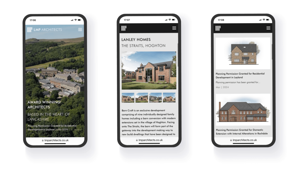
LMP Architects are an award-winning RIBA and CIAT Chartered Architects practice in the heart of Lancashire. They’ve provided clients with architectural services for over 30 years and their website no longer reflected their professional, state-of-the-art designs. They therefore decided to invest in a new website that put showcasing their impressive work at the forefront of the whole customer journey.
The Brief
WHAT WE DID
LMP Architects’ (LMPA) old site was functional, but extremely dated in terms of appearance and content. It was over 10 years old! It didn't show off the sort of eye-catching work that they’ve done as effectively as it could have done, and had generally reached the stage where it was in need of a design and technology refresh.
LMPA did their research and saw the smooth, easy-to-navigate online experience that some of their competitors were offering. They then reached out to us to help them to beat it! LMPA chose to entrust us with this important website rebuild because of our previous work with a variety of reputable and related brands, so they were confident that we could deliver their vision whilst adding our valuable industry expertise throughout the process.
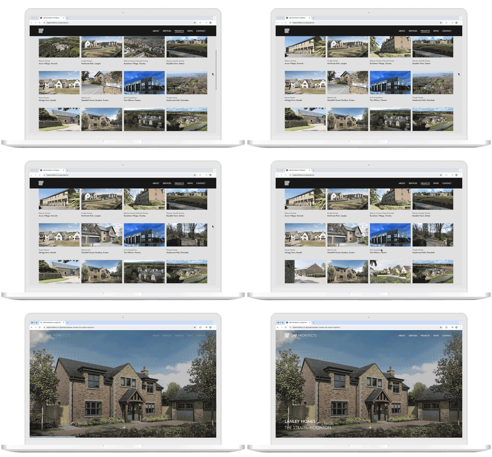
As award-winning architects, LMPA wanted a brand new responsive brochure site that focused on creating a modern portfolio to showcase their projects. It needed to bring together both their old and new content to emphasise their work and expertise. It also needed to feed into their goal of getting more enquiries through their Contact Us form.

Initial Investigations
HOW WE APPROACHED IT
LMPA already had some of their own designs in mind. They were envisaging a site that was generally monochromatic and minimalistic, avoiding black in favour of dark grey, but incorporating flashes of colour where appropriate. As well as architectural drawings, they told us that they were inspired by subtle nods to retro-futurism, brutalism and minimalism, and wanted that to be reflected in their branding and stationery. They really wanted their new site to not only be fully-adapted for modern technology and devices, but also serve as a video and image-focused portfolio.
Simplicity of design was at the very core of the LMPA client brief. Therefore, slick and elegant functionality was essential to help with user engagement in what is a very uncluttered, monochrome design. Unfortunately, Sketch didn’t offer the capability to exhibit that at the design stage, so we decided to migrate to Figma: a much more powerful piece of software. This move benefited not only LMPA, but also the wider operations at Soap! It gave us the ability to offer real life functionality to LMPA and future partners, and also helped to improve communication. Figma offers some great collaborative features right out of the box. Real time conversations and comments can be added within the software to streamline the review process. Additionally, the dev mode service not only speeds up the handover process, but also offers code snippets, from multiple code bases, that developers can copy and paste.
Off the back of all of our preparation, our introductory design meetings with LMPA were very productive, and we gave them plenty of time to reflect upon the solution that was going to suit them best. Because of the specificity of their requirements, we recommended a fully-bespoke brochure website utilising our WordPress SUDS platform, as this was the best way to give them the custom layout and functionality that they wanted. Once we’d both agreed upon the design direction, we made sure to offer them as much support and guidance as they needed and, of course, we also set to work with the new build!

First Steps
GETTING STARTED
LMPA were very keen to be able to give their input throughout the build process, and so we very quickly set them up with a staging domain that allowed them to provide real-time feedback even outside of our scheduled email communications and online meetings. Our Lead Front End Developer and Development Account Manager attended various meetings to make sure that LMPA were getting all of the answers to their questions straight from an industry expert.
We knew that LMPA had a really clear vision that they couldn’t wait to see made into a reality, so we made sure to accommodate as many of their innovative ideas as possible. We also gave them access to the CMS to edit layouts and content themselves very early on, which they were able to do confidently after a thorough training session with our Development Account Manager, which we offer as standard to all clients prior to launch.

Building a Solution
WHAT WE DID
The new LMPA website was based upon WordPress, but it was custom built using our Suds platform. This meant we could be extremely flexible, and create something bespoke in a really streamlined timescale. We carried out lots of QA tests (including accessibility checks on colours and forms) on a wide range of devices to make sure that the new build really was pixel perfect. In fact, at one point we actually did amend an element of the site’s design by 1 pixel. When we say “perfect”, we really do mean it!
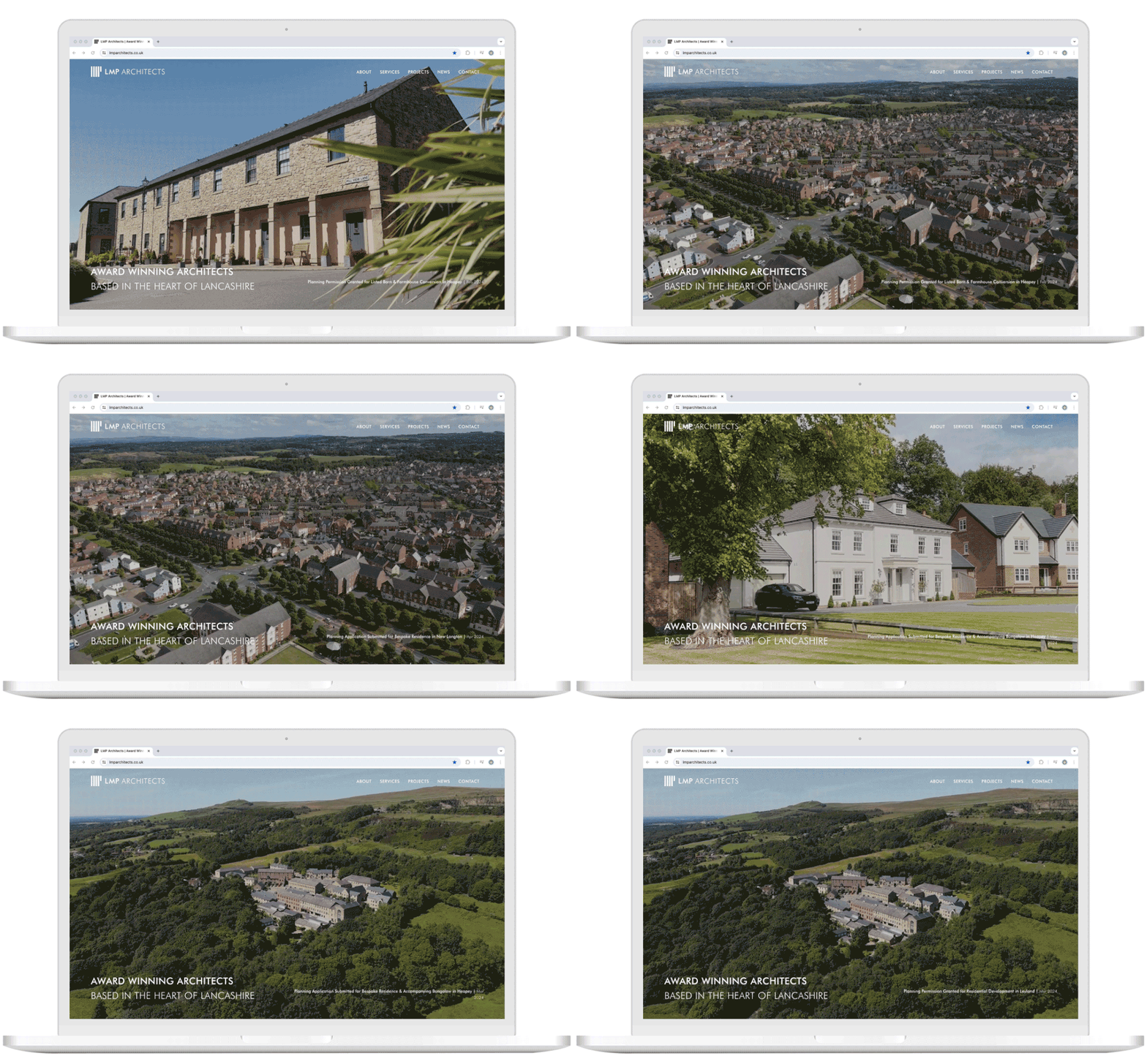
A key consideration for LMPA was the banner video on the homepage. To ensure no impact on page speed or certain devices, we implemented a static image of the first frame to go behind the video to ensure a striking first impression to all users, even those who couldn’t successfully load the video on their device. However, aligning this image and video proved to be fairly tricky! Both output differently, so our developers had to carry out some CSS wizardry to match them up. Initially, the solution worked on Chrome, but was glitchy on mobile devices. However, we persevered and ultimately delivered a solution that met LMPA’s expectations on both iOS and Android.
The major difference between the LMPA site and many of the other projects we work on was the requirement to integrate a lot of animations on the site. They didn’t want the majority of the build time to be spent on this, so we worked as smartly as we could to incorporate some really nice animations and parallax scrolls. Of course, lots of animations could have meant that the site ended up being fairly slow, so we took steps to prevent that too. We used a plugin called Filebird to optimise the WordPress media library’s organisation, and Smush to compress site files. The end result was a site that looked and loaded great.
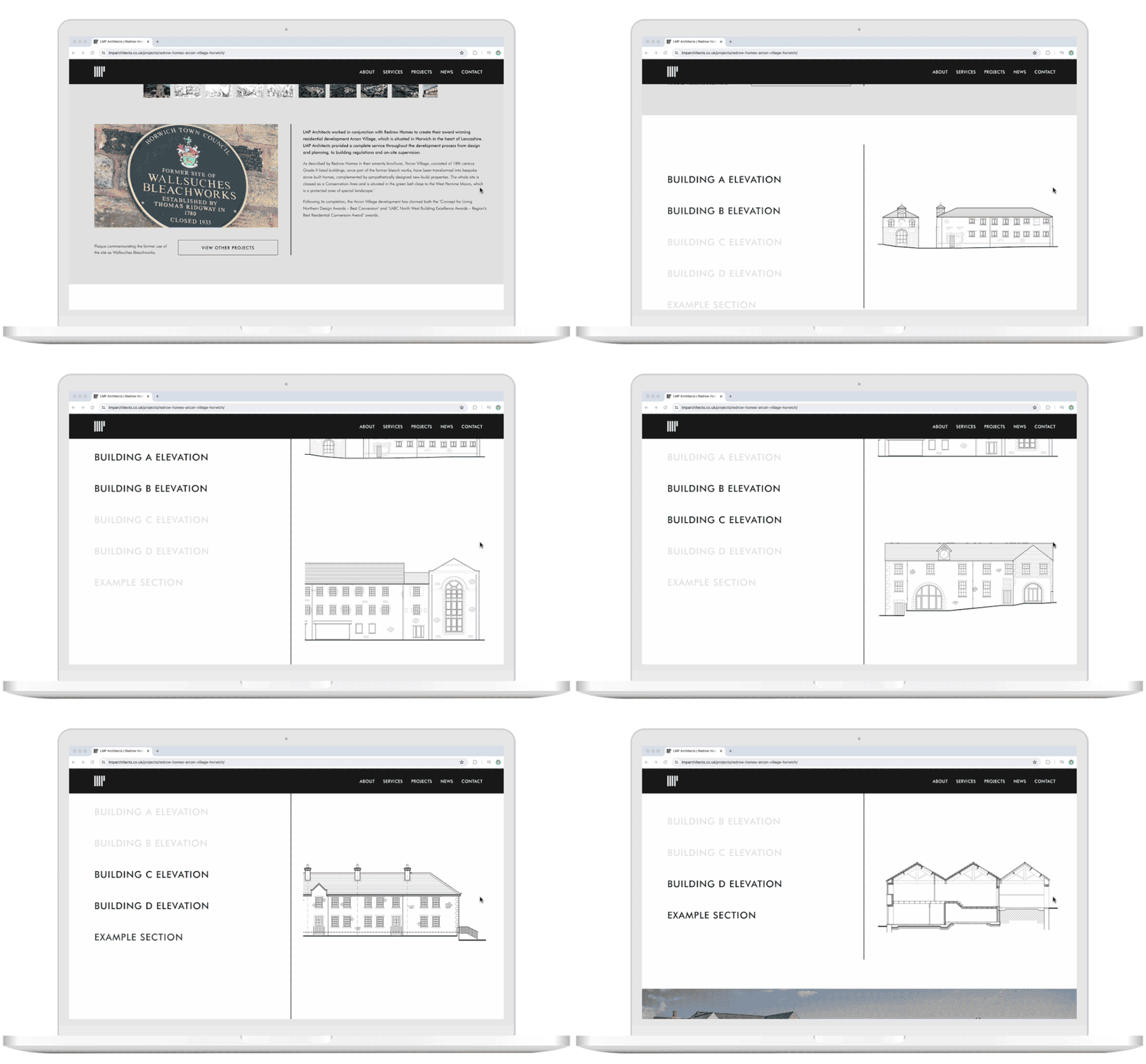
To create the animations, we mainly used the Animations On Scroll library, as this made it very easy to add fade, flip and/or zoom animations to any elements or sections of the site that would be triggered as a user scrolled on a page. The vertical separator line on the new LMPA site was created in this way too (the speed of this can handily be controlled from the CMS!). However, we also wanted to go the extra mile for LMPA, so we built a few custom animations including an anchored scrolling section (where the left-hand side content is sticky, while the right-hand side is scrollable) and a variety of sliders on the project pages.
To conclude the process, we also handled the full migration of their old site to the new build, and carried out a range of thorough pre-launch checks. We kept LMPA updated at every stage of the build journey, and ultimately delivered a silky smooth site launch. LMPA were delighted to be left as the proud owners of such a unique and exceptional web presence. You can check out the new LMPA website for yourself!

The Results
After the new site had bedded in, we saw the following results:
145%
increase in organic traffic to top performing pages
80%
increase in first page keywords
Don’t Just Take Our Word For It…
Here’s what our clients have to say about us:
"Soap Media guided us from concept to completion with excellent communication and highly skilled work to generate our fantastic new web presence. All work completed was to an excellent standard with any issues or ideas clearly communicated in advance.The original cost estimate was reasonable/comparative for the work involved and additional work was quoted for and agreed to in advance. Each development stage was clearly mapped from the outset of the project and all timescales/deadlines were met with clear communication throughout. I anticipate that following the launch of our website we will be asked who we worked alongside and we will be more than happy to recommend Soap Media."
Submitted via Clutch
“We are incredibly happy with the completed site, and Soap Media [has] brought our vision into reality with very little compromise. This has been reflected by the response of our clients and colleagues alike, for whom the feedback has been equally positive. “Soap Media's ability to bring our vision into reality alongside their accommodating and willing attitude towards our ideas, regardless of the potential technical issues to overcome to achieve them, was very impressive and has led to the creation of a unique and exceptional web presence.”
Director of LMP Architects
Get Your Free Consultation
tailored solutions that will surpass your targets
Whether you’re looking to forge a new partnership or investigating agencies for the very first time, our experts can understand your goals and structure tailored solutions that will surpass your targets.
- 1Discuss Your BriefOutline your business objectives exactly, then uncover how we can not only help you to succeed but sky-rocket your KPIs.
- 2Secure Your SuccessLearn about our tried and tested, data-driven solutions to your digital problems, and see how our industry-leading innovation can help you reach your goals.
- 3Grow Your BusinessWe’ve helped some of the biggest brands in the UK to exceed their ambitions, and we’re eager to discuss how a holistic digital strategy could upscale your business performance too.

By submitting this form you agree to our privacy policy.
What We Could Do For You
If you'd like help with your digital marketing and our work on this project has inspired you, why not get in touch with us to discuss your plans:
Services We Provide
Perhaps you're interested in working with us in another area? Other services we provide include:
Our Other Experience
We've also completed big projects for companies across a wide variety of sectors that you might want to take a look at.

