Casa Ceramica
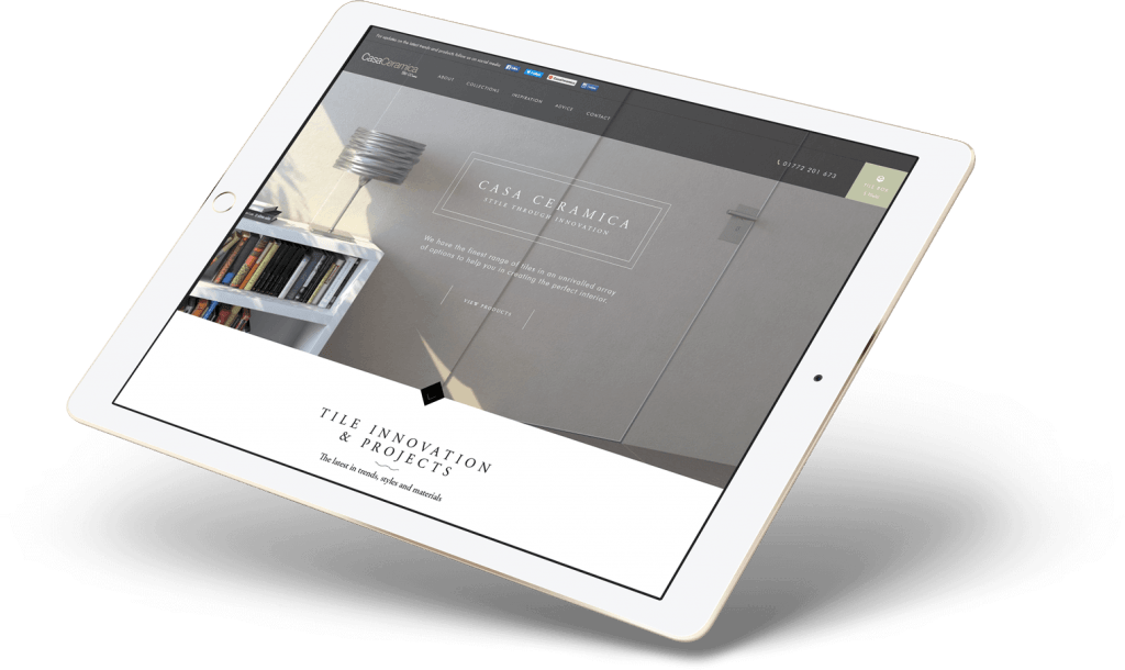
Casa Ceramica is an award-winning tile company offering a variety of high-quality bespoke products. Five years after we developed its original website, Casa requested a redesign and built-in marketing strategy in order to bring its brand to a new audience.
The Brief
What we did
The previous website didn't reflect the direction and client base Casa cater for. Whilst the site was generating good business results and had strong search engine positions, the content and visual presentation were had simply become outdated.
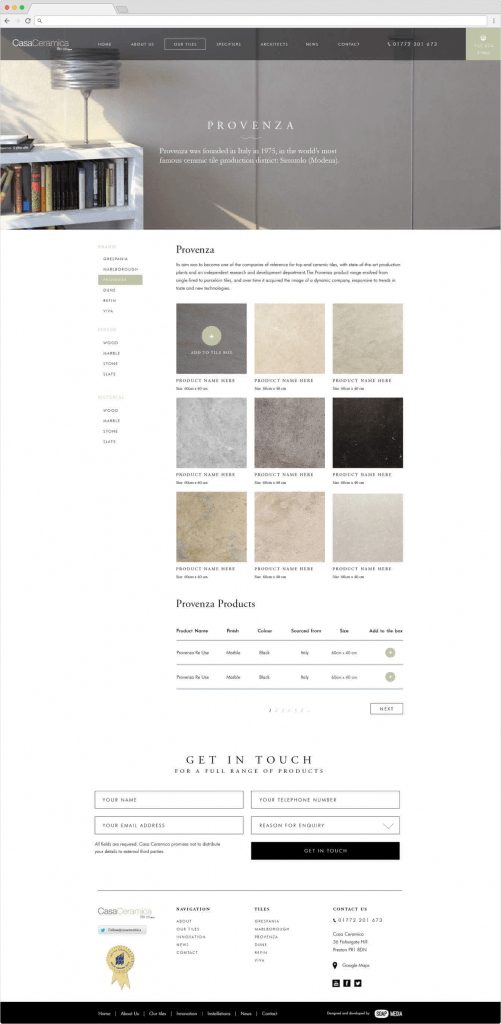
The challenge involved creating a cutting edge new website which could balance strong visual imagery with usability. With out web design and development know how, attention was placed on the latter, as a customer’s journey is of paramount importance to any new design. We researched and developed a user journey map to establish easy access whilst browsing products; a tile interface allows customers to store products of interest in their Tile Box, introducing a highly intuitive world of shopping driven by outstanding visuals.
A responsive design also needed to be incorporated to allow for a wider user base. In the ever growing mobile market, it was vital the company’s site was visually engaging and had user-friendly features for the mobile community’s ease of use.
A High Quality Finish
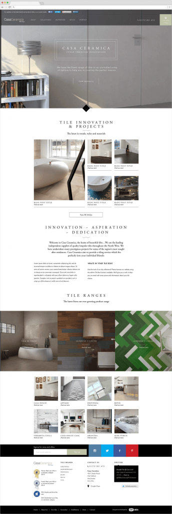
We wanted to convey the fantastic results Casa Ceramica would supply to its customers in the design of the website. As a result, we ensured we developed an elegant, sophisticated website which reflects the outstanding quality of the company's products.
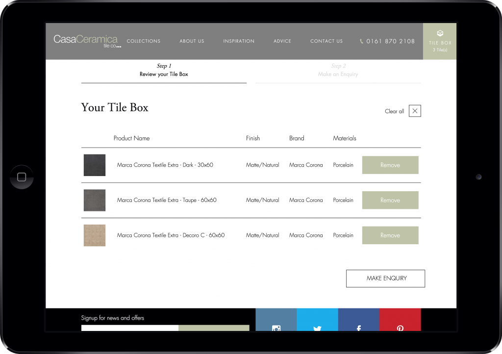
Casa Ceramica’s site boasts a unique and accessible shopping experience. We perfected the Tile Box shopping interface from which users can easily access products of interest. Its inclusion makes for a perceptive user interface, where customers are able to observe potential purchases and glean a visual understanding.
The new layout provides a precise and clean experience, with tabs indicating the whereabouts of Casa Ceramica’s best designs, features, and contact information. Alongside this, their social media accounts are boldly highlighted, and through the likes of Pinterest and Instagram they are able to maintain their distinctive online visual presence.
Mobile First

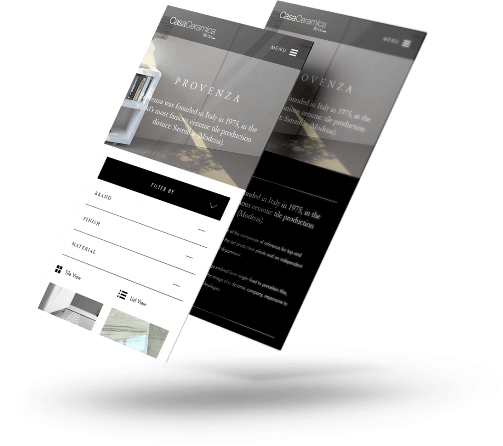
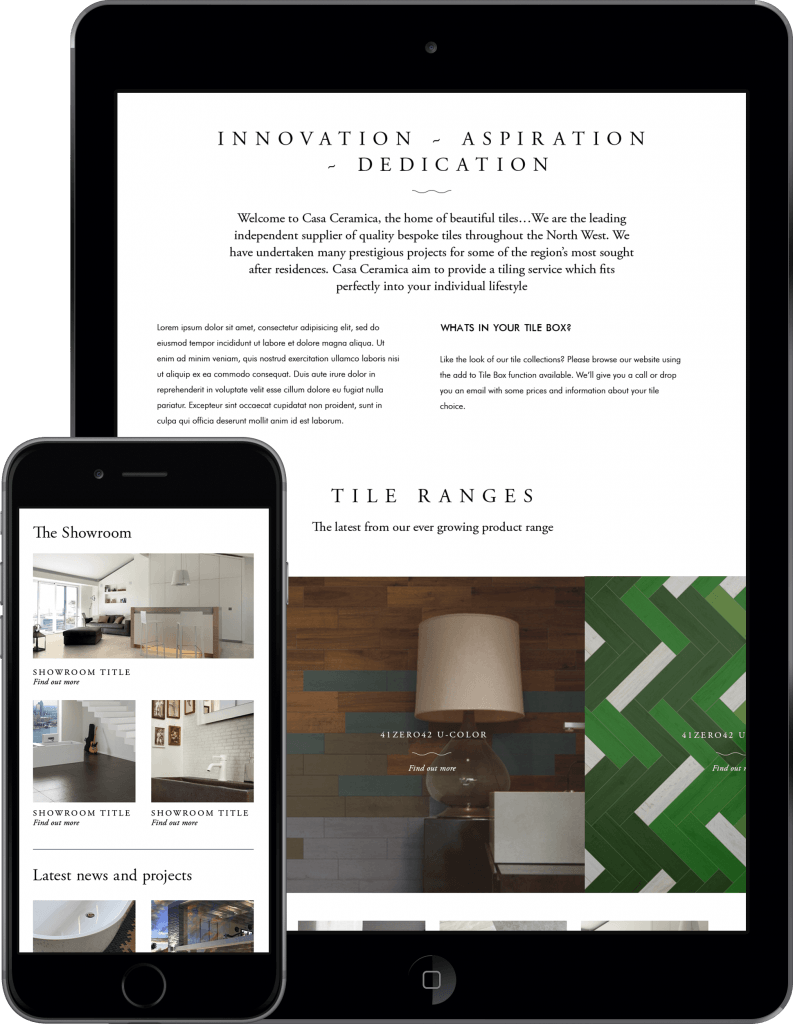
Casa Ceramica required a responsive design for mobile convenience. With its desktop counterpart being so visually engaging, we worked to achieve the same outcome for a modern mobile experience. Most notably, to combat capacity restrictions, the Tile Box acts as a drop-down menu for easy access.
The Tile Box & Web Visuals
This feature allows customers to easily and efficiently select tiles and move them to the checkout queue. This assists with streamlining the checkout process, whilst providing visuals reminders of the products customers are intending to purchase.
Website Visuals

Dramatic yet never overwhelming, we applied stylish photography with artistic flair. Casa Ceramica not only looks spectacular, it has been purpose built to be user friendly and persuasive. This leaves an indelible impression on visitors, with the company’s quality products and overall expertise encapsulated by their new online presence.
What We Could Do For You
If you'd like help with your digital marketing and our work on this project has inspired you, why not get in touch with us to discuss your plans:
Services We Provide
Perhaps you're interested in working with us in another area? Other services we provide include:
Motion DesignSaaS SEO AgencyB2B SEO AgencyOn-Page SEO ServicesOff-Page SEO ServicesInternational SEO AgencyDigital Design & Social Media AssetsDesign for PrintBrand GuidelinesBrand IdentityLocal SEO AgencyTechnical SEO ServiceE-commerce SEO ServiceOrganic SEO ServicesWeb DesignShopify AgencyLead GenerationWeb DevelopmentUser Experience (UX) DesignBranding & Creative DesignDigital Strategy
Our Other Experience
We've also completed big projects for companies across a wide variety of sectors that you might want to take a look at.

