Booths Recruitment

Founded by Edwin Henry Booth in June 1847, Booths is a much-admired supermarket chain with 29 retail stores situated throughout the North of England. We worked closely with the company over four years, implementing several web-based software solutions.
boothhero

The Brief

What We Did

Booths used to recruit offline with a decentralised process. This proved intensive, expensive, and candidate data couldn't be seen or managed centrally.
We were tasked with developing web-based tools to manage applicants through each stage of recruitment. Alongside this, we developed internal communication tools for contracts and personalised handbook information which could be used with successful candidates. By introducing automation of communications both internally and externally, We reduced administrative tasks and created a streamlined process.   Booths wanted to improve the calibre of candidates, whilst simultaneously introducing an application process which would prove more accessible. To tackle this, we removed targeted geographical locations – this allowed vacancies to be visible nationwide. Through the website, we were able to empower and support local stores to manage vacancy requests and candidate screening in a more efficient manner.
Booths Clipboard

Developing A clear Strategy

Wireframes-–-BOOTHS-RERUITMENT-1024x913
The site needed to convey the warmth and hospitality the supermarket is renowned for, whilst offering a user journey which was simple, clear, and intuitive.
The process involved organising information and wireframing to present the most effective interface for applicants and internal staff, a technique we’ve used successfully with our restaurant website design.
Wireframes-–-BOOTHS-RERUITMENT-1024x913

Perfecting Booths Look

People-centric ideals

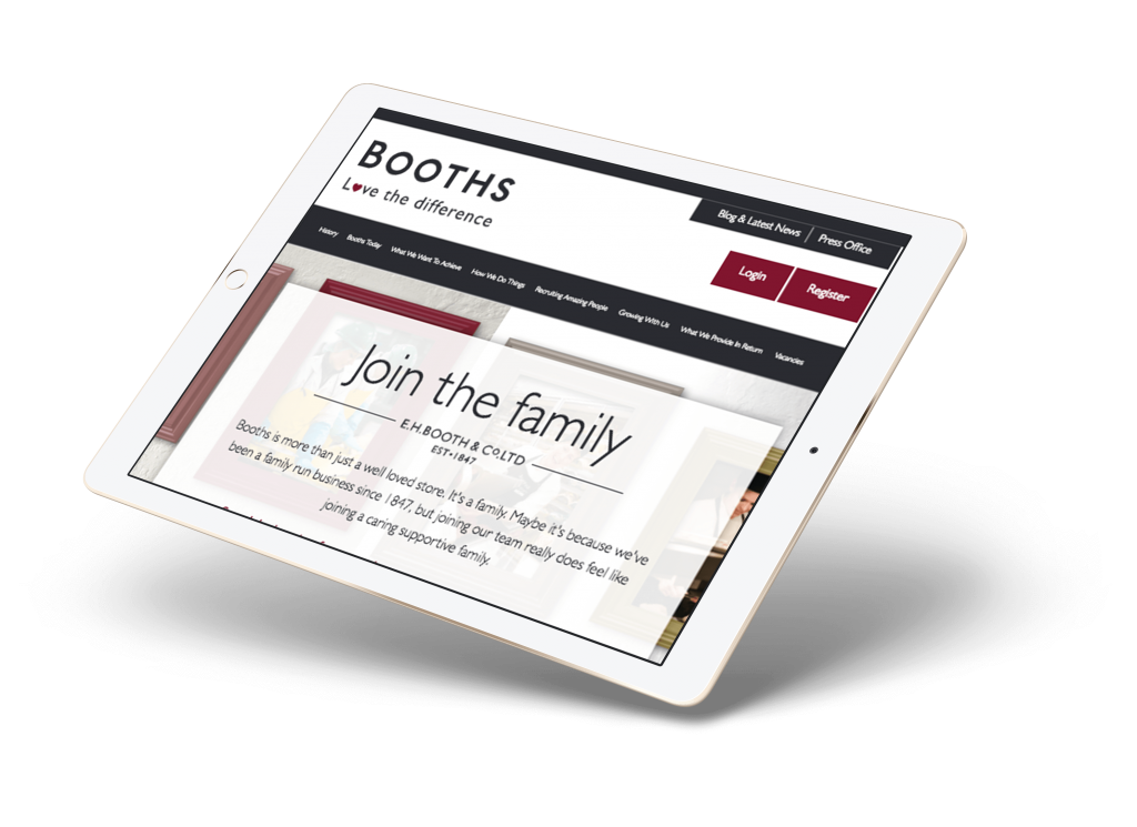
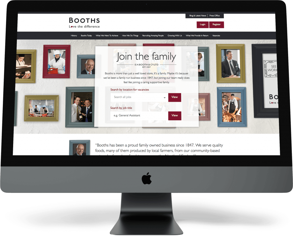
By using pictures of the Booths’ employees, we emphasised the overall theme of a family business.
We created a professional and responsive website which can be edited in WordPress. User-friendly navigation is included so visitors can move from one area of the site to the next with ease, as well as making it clear which section of the site they landed on.   The redesign of the site provides the user with a straightforward and distinctive online journey, one which expresses the people-centric ideals the brand maintains. The overall calibre of candidates has massively improved due to this added exposure.
iMac — Front — Content
framesBooths
What We Could Do For You
If you'd like help with your digital marketing and our work on this project has inspired you, why not get in touch with us to discuss your plans:
Our Other Experience
We've also completed big projects for companies across a wide variety of sectors that you might want to take a look at.