Jaguar just unveiled its new logo as part of its bold transformation into an electric-only car brand. While the shift to sustainability and innovation is exciting, it’s safe to say the brand’s new logo has been met with mixed reviews. Some critics praise its minimalist aesthetic, while others feel it doesn’t capture the spirit or legacy of the iconic British automaker.
Given all the chatter, we wondered: what would artificial intelligence tools make of Jaguar’s new logo? Could AI design something more striking, innovative, or aligned with the brand’s electric future? To find out, we put four of today’s most prominent AI tools (ChatGPT, Copilot, Gemini, and Claude) to the test.
We showed them Jaguar’s new logo and asked them two questions:
- Disregard what you know about Jaguar, the existing brand for luxury vehicles. Based entirely on the visual provided, what type of company does this branding/logo suit well for?
- This new logo and branding are in preparation for Jaguar’s relaunch as an electric-only car brand. How would you rework this logo to be a better fit?
Here’s what they came up with and how their suggestions stacked up.
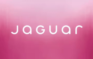
For context, here is the initial image we fed each tool:
ChatGPT
What it thought of the new logo:
Based on the visual style of the logo you provided, which features a sleek, modern typeface and a gradient pink background, this branding could suit the following types of companies:
- Fashion or Beauty Brand – The clean and elegant typography combined with the pink tones is often associated with luxury, femininity, and trendiness, making it suitable for high-end clothing, cosmetics, or skincare companies.
- Tech Startup or Digital Design Firm – The minimalistic and modern design could also align with tech-focused companies that value innovation and a forward-thinking approach.
- Luxury Lifestyle Brand – This could include high-end fitness or wellness brands, such as boutique gyms, yoga studios, or wellness products.
- Creative Agency – The artistic gradient and stylish font could represent a company in the creative field, such as branding, marketing, or design firms.
- Modern Jewellery or Accessories – The sleekness and sophistication make it ideal for companies specialising in contemporary jewellery or premium accessories.
The gradient pink background further enhances the feeling of vibrancy and sophistication, which might appeal to audiences seeking modern and upscale products or services.
How it thought the logo could be improved:
To make the Jaguar logo better fit its relaunch as an electric-only car brand, here are a few design tweaks and enhancements to emphasise the transition to sustainability, luxury, and cutting-edge technology.
- Incorporate Subtle Electric Motifs – Add a faint, glowing underline beneath the word “Jaguar” to evoke electricity or a charging line. A gradient of blue and green could emphasise eco-friendliness and clean energy. Or, introduce a small lightning bolt or spark design subtly within one of the letters, like the “J” or “A.”
- Evolve the Font – Keep the minimalist style but slightly sharpen or streamline the edges of the font to convey a sense of speed, innovation, and luxury. Experiment with futuristic serif or sans-serif elements, blending elegance and technology.
- Update the Colour Scheme – Use accents of vibrant green or silver to convey eco-friendliness and premium quality.
- Include a Jaguar Silhouette – Subtly integrate a modern, sleek outline of a jaguar leaping over or around the text. It could represent the brand’s heritage while emphasising agility and power in a new electric era.
- Add Texture or Depth – Give the text a metallic or brushed-steel texture to echo the high-tech materials used in electric vehicles.
How it would have designed the new logo:
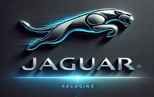
ChatGPT’s design featured sharp edges, dynamic lines, and vibrant colours that blended tradition with futuristic vibes. However, there were some quirks (like the word “relaginc”?!), reminding us that even AI isn’t perfect. Still, its effort to merge eco-consciousness with luxury was commendable.
Copilot
What it thought of the new logo:
The branding and logo you’ve shared features the word “JAGUAR” in a modern, minimalist font against a pink gradient background. The sleek, rounded style and contemporary look make it a great fit for:
- Fashion Brands – A high-end clothing line or a chic boutique that emphasises style and elegance.
- Beauty Industry – Cosmetics, skincare, or a luxurious spa, offering an array of pampering and beautifying products or services.
- Lifestyle Products – High-end wellness products, aromatherapy, or even upscale home decor.
The pink gradient adds an element of elegance and sophistication, which would be particularly appealing to brands targeting a stylish, discerning audience.
How it thought the logo could be improved:
Reworking a logo for Jaguar’s electric-only future could be quite an exciting challenge. Here are a few ideas to enhance the logo and make it a better fit for its electric relaunch:
- Incorporate Electric Elements – Integrate subtle design elements that evoke electricity or clean energy. For example, you could include a sleek lightning bolt or use a gradient that mimics the flow of electric current.
- Modernise the Typeface – Use a more futuristic and sleek typeface. Something minimalistic yet bold to reflect the cutting-edge technology of electric vehicles.
- Change the Colour Scheme – Opt for colours that symbolise sustainability and innovation. Greens, blues, and whites can signify clean energy and a bright, sustainable future.
- Use Dynamic Motion – Add a sense of motion to the design to convey the idea of energy and forward movement. This could be achieved with dynamic lines or shapes that suggest speed and agility.
- Simplify It – Electric vehicles often represent a more streamlined, efficient future. A simplified, cleaner version of the logo could resonate with this vision.
How it would have designed the new logo:
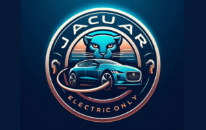
Copilot’s design added a sense of motion and vibrancy to the original logo, but it wasn’t without flaws, like accidentally renaming the brand “Jacuar.” Despite this typo, its vision aligned well with the brand’s forward-thinking mission.
Gemini
What it thought of the new logo:
The “Jaguar” logo in the image suggests a company that is:
- Modern and Minimalistic – The clean lines and simple typography give a sense of modernity and sophistication.
- Feminine or Delicate – The pink gradient background adds a touch of femininity and softness.
- Possibly in the Fashion or Beauty Industry – The combination of modernity and femininity aligns well with these industries.
- Possibly a Tech Company – The minimalistic design could also work for a tech company that wants to convey a sense of innovation and elegance.
Without more context, it’s difficult to say definitively what type of company this branding would be best suited for. However, the visual cues suggest a company that is modern, feminine, and likely in the fashion, beauty, or tech industry.
How it thought the logo could be improved:
Here are some ideas on how to further refine the logo to better align with an electric-only brand.
- Emphasise the “E” in “Jaguar” – Either change its colour to a vibrant blue or green hue for the “E” to symbolise electricity and sustainability or add a subtle glow or energy pulse animation to the “E” to convey dynamism.
- Incorporate Electric Elements – A subtle lightning bolt motif could be integrated into the logo, perhaps as a background element or within the letterforms. Or, consider using thin lines or gradients to suggest the flow of energy around the logo.
- Modernise the Typeface – Opt for a clean, modern sans-serif font to convey a futuristic and streamlined aesthetic.
- Play with Negative Space – The letterforms could be designed to form a subtle silhouette of a sleek electric vehicle or a stylised jaguar.
- Change the Colour Palette – Choose a colour palette that reflects the brand’s identity and evokes feelings of modernity, luxury, and sustainability.
How it would have designed the new logo:
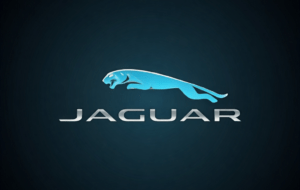
Of all the AI tools, Gemini produced a design that most closely resembled Jaguar’s original logo. While this showed respect for the brand’s heritage, it arguably didn’t push boundaries as much as the other tools.
Claude AI
What it thought of the new logo:
Based on the visual, this branding and logo would suit a cosmetics or beauty-related company well. The soft, gradient pink colour scheme and simple, stylised text evoke a feminine, high-end aesthetic that is common in the cosmetics industry.
How it thought the logo could be improved:
To better fit Jaguar’s relaunch as an electric-only brand, I would suggest the following updates to the logo:
- Incorporate Electric or Sustainable Design Elements – Use shapes, colours, or typography that evoke clean, modern electric vehicles.
- Emphasise the Electric Transition – Prominently feature the word “Electric” or an “EV” designation alongside the Jaguar name.
- Streamline the Typography – Use a sleeker, minimalist font style to match the aesthetic of electric vehicles.
- Adjust the Colour Palette – Consider a cooler, more tech-forward colour scheme beyond the traditional Jaguar pink/purple hues.
- Add Dynamic, Forward-Looking Imagery – Incorporate abstract shapes, lines, or gradients that convey a sense of motion and innovation.
How it would have designed the new logo:
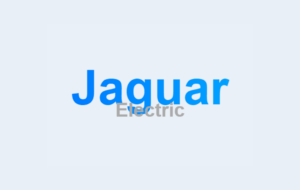
The result from Claude AI was incredibly underwhelming. It failed to stand out or convey Jaguar’s forward-thinking electric vision. While functional, it lacked the “wow” factor that we think Jaguar’s rebranding deserves.
Our Thoughts on the AI Logos
Each AI tool brought something unique to the table, but a few patterns emerged. For one, all four leaned heavily into blues, silvers, and greens; colours traditionally associated with eco-consciousness, technology, and the electric revolution.
ChatGPT and Copilot impressed us the most with their creative approaches. ChatGPT’s emphasis on integrating subtle electric motifs and a jaguar silhouette was a thoughtful way to balance innovation with heritage, and Copilot’s focus on dynamic motion and futuristic typography resonated with the idea of an agile, high-tech electric vehicle.
Gemini, while playing it safe, did a good job of respecting Jaguar’s current branding. Its designs were clean and practical, though perhaps too conservative for an electric relaunch. On the other hand, Claude AI’s suggestions and designs felt the least innovative, emphasising simplicity at the expense of excitement.
Overall, although the AI tools we able to offer some interesting takes, they weren’t without their flaws. Looks like design team everywhere are safe – for now.
